I wasn't in love with the design this year, but now that I have them in hand, I do like them. I feel like Topps Fire is a lot like Topps Lineage (which by the way, I wish they'd bring back); it's nice to look at a different design and picture other than the same picture that Topps uses in all their sets for the year.
 |
| Base cards. I really like the bottom design. |
 |
| Royals PC |
 |
| Hits |
 |
| Cubs PC |
Colors


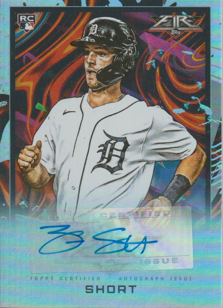 |
| Got an autograph! |
Inserts


No comments:
Post a Comment